I last blogged about these paintings when they were half done (and the paint was frozen). I have now completed these and have had chance to discuss them at a group crit and contemplate how I feel about them – as well as play with some of the printed stripes.
These are the original 2 palettes that I have recreated as large canvas paintings using the nearest coloured emulsion I could find.


I left the canvases until the weather warmed up and I could use the paints properly and bear to be out in the studio!
I had decided to concentrate on the flatness and purity of colour on the bright canvas (left palette) and play with the surface and texture on the paler canvas (right palette).
I had an annoying day at work and decided to take this out on the surface underpainting I was planning (this was a good plan as it had time to dry before I painted the colour on the next day). I chose not to do anything particular and just sloshed and splodged and dripped the eggshell paint onto the canvas in a random and expressive way, trying to focus on interesting marks and textures. Frustration vented on the canvas I left it to dry overnight.


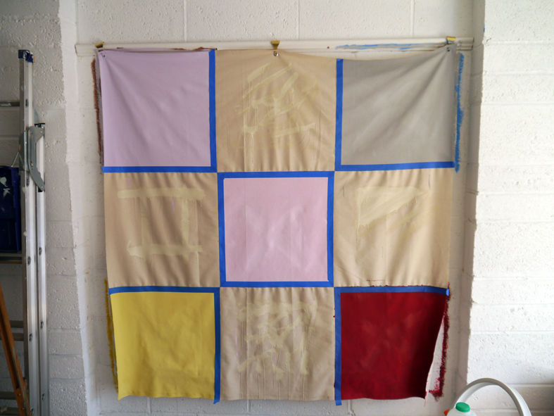
I painted in the remaining squares (both flat and textured) and became fascinated by the qualities of the flat colour and how the paint changes as it dries. The emulsion also has problems attaching itself to the eggshell on the initial coat and this caused an interesting effect too – although I ultimately wanted the underpainting to be far more subtle.
To create a very flat colour (on the unprimed, natural canvas) it is best to water down the emulsion and paint several thin layers. This leads to a fantastically flat colour. The nature of emulsion seems to be to spread a little to give an even finish – so this seems better than acrylic or oils for creating this surface. Equally, the thin paint allows it to build up evenly on the underpainting – allowing the drips to still retain their definition. The underpainting has effectively ‘primed’ the canvas and robbed it of some of the natural texture (making it flatter) and therefore making it more noticeable when the flat colour is applied over the top.


Once the paint dried I started to experiment with satin and gloss varnish on some of the squares (actually very little difference in the finish – so not worth worrying about the which one to use). The below images show how the underpainting and the varnish shows up when the light differs (flash/natural light). The pink square only has underpainting – and you can see how subtle it is (it appears lighter because there is less texture on the canvas at this part – where there is texture, it creates more shadow and therefore a slightly darker hue). The texture and varnish is very hard to show by photograph and are much more subtle and yet more visible with the naked eye.


These are the finished hanging works – bear in mind these are very large (150cm sq – the scale can be seen by the light switch).


While I was painting the large canvases, I also painted small 7cm stretched canvases at the same time to facilitate reordering and mixing of the palettes.


I have a massive desire to order colours in pale to dark and across the spectrum, so I began reordering them in that fashion. From the research that I did for my Feeling Blue? essay in year 1, I know that humans like to order colours that correspond most to how they see them appear in nature. Beau Lotto (featured on BBC’s Horizon: Do You See What I See?) found that he could predict what colour people would choose next when asked to defined a grid of colours (rather like my own palettes). Which I suppose means that these choices were pretty obvious.


As I was then to display the photo prints of my stripes, I had to move the mini canvases off of my display wall and onto my working wall to make enough clear room. As I transferred these blocks, I was also delighted by the new combination palettes that these made. I found this process wholly satisfying.


I had the first 3 months of my stripes of colour diaries printed as photographs so I could display them around my studio and see how I felt about being surrounded by them and what sort of environment they created. The 2 sets of stripes above one another are my ‘pleasing’ set where I have reordered the stripes. Much more effective though are the single stripe (which is December in order – the palettes are displayed, starting at the left, in the order I wrote them down in). I like these as a stripe in themselves around the room. However, I felt the photos were of the wrong proportion for the environment. I need them to be narrower in something with such a low ceiling – but they could remain at this size if the space were a bit taller and larger. Ultimately I would like these to run around an entire room giving the entire year in one continuous, evenly striped, band.


By reducing the height of these photos the colours gain more clarity and power. The slice of jewels across the white is amplified because of their height and the proportion of the stripe changes and appears to ‘widen’ where the height is reduced.


Links to the fantastic Do You See What I See? (as mentioned above) first broadcast on BBC in Aug 2011.
Horizon Do You See What I See Part 1-4 by plamenj
Horizon Do You See What I See Part 2-4 by plamenj
Horizon Do You See What I See Part 3-4 by plamenj
Horizon Do You See What I See Part 4-4 by plamenj
Reflection
By creating these palettes (albeit from arbitrary things in my day-to-day environment) I am stripping mood, emotions and environment back to one of their most basic elements – colour.
When viewing these whole canvases (and large in the environment) I want to view the bright palette as a whole – absorbing the colours and their effect on me. They are luminous and seem to radiate a warmth. They are earthy, landscape colours and do suggest an outdoor environment.
The paler canvas I want to look at as individual squares. The interest is less in the palette as a whole and more about the surfaces that have been created in each square. This does suggest that I should further investigate surface and texture with flat colour.
Creating a totally flat surface devoid of marks, interest and detail became a big concern when creating the bright canvas. This canvas became all about the purity of the colour – and this has become a bigger concern with the striped panels. In many respects I prefer these to the squared palettes as the colours are purer – they are only influenced by colours on 2 sides of them – whereas they are influenced by 2, 3 or 4 colours in the palettes.
Why am I choosing these materials?
I like painting on the fabric canvas. I find the fabric more intimate and less formal than stretched canvas – it is fluid, can be manipulated by the hand, shaped, held, have things scooped onto it etc. The flapping edges also lead to an idea that this could be wrapped around you (they often curl when painted) and at times feel as though the palette is reaching out towards you, ready to envelop you when you are not looking.
I had initially planned to paint on the wall, but decided that was not immersive enough. The rest of the room in the peripheral seemed too distracting. What I like about the canvas is the edges. They do not recede in the same way a wall would. The shadow it creates pushes the work forwards towards the view
Use of emulsion allows for better flat colour than artists paint. Unprimed canvas allows for underpainting. Both of these facilitate easier layering. and the possibility of including ‘secrets’. The varnish shows up on some colours and darkens others – this needs to be tested before I could use it with certain colours.
Scale. Why these extra large and extra small canvases?
We see colour all around us all the time. We are used to seeing it. It is nothing new. What is different about these palettes is the scale of the blocks of colour. The large ones attempt to overwhelm us, to dominate our environment and block out all that is around us – to be all that we see, so we truly absorb the colours. To take something that could be pixel sized (to take a modern analogy) and turn it into something the size of a house wall. The small canvases are like punctuation in the environment. They disrupt the surface they are on with either vibrant or calm colours in a regimented structure which is not usually seen in nature.
Surface and texture
The creation of a flat surface is very important on those works that I wish to be about pure colour. I want there to be no distractions and the colour to be as pure as possible – so it is hard to know where you are in the square if you are looking at it close – almost as though you have your eyes closed and that is the colour you are seeing. Your entire world, at that moment, is that colour (or that palette) alone. How the colours interact with one another and with your own personal emotions and memories that are connected with that colour. These palettes will have entirely different meanings for each viewer according to your own personal connection and experiences with each of the colours used.
The texture began out of an accident. However, it is an interesting avenue to investigate. Again, a flat colour here is essential to allow the texture to ‘shine’ through without being hampered by a busy overlay of differing colours.
Ordering
The reordering of the small squares is extremely pleasurable and I could do it endlessly. Very much like these small squares and the ability to reorder them and make new combinations. However, this is likely just my ‘prettiness’ gene taking over to make them aesthetically pleasing to me.
Stripes
I feel that the stripes are very dependent on the environment for scale. Perhaps a thin strip of jewel like colours is more appropriate (as discussed above). I have chosen to order the stripes L-R and as vertical strips because they seem to suggest less of a structured order this way. Oddly, horizontal stripes reading vertically seem to suggest a defined order to me (perhaps because there is a naturalness of light to dark, light to heavy associated with up and down). This could be played against later perhaps.
Progression
- Having the stripes running entirely round the room from an entire year – so there is no start and no end – a cyclical year. Perhaps also try running these across the floor and UP the walls and across the ceiling to try a different affect. How does this affect the reading of them?
- Immersive colour – where there is NO peripheral of ‘other’ to distract you from the colour. Perhaps a room needs to be made entirely from the canvases?
- What if I made something to place your head into? It would be enveloping and somewhat claustrophobic, but there would be no escaping the colour. Would the closeness of the environment change the way you respond to the colour? Would bright colours now seem oppressive?
- What happens if you blend the squares? Keep blurring an blending the squares until the sum of the colours becomes one solid one. Making a sum of the whole. All of the colours blended into one solid: the defining colour of one whole day. Would all days be the same muddy colour?
- It might be interesting to pop small squares in the appropriate environment to punctuate it. I know that Stig Evans has created a series of works called Interventions that have him find a Dulux colour swatch of something in the environment and photographing that colour blending in. I would rather pick 9 colours from what I see and punctuate some colours with others that I see in the environment (i.e. punctuate the daffodils with the colour of the sky, the trees with the daffodils etc.) so they blend in with the general panorama, but jar once spotted?
- Experiment more with texture and surface. Perhaps try using Polyfilla to create deep, textured surfaces or super-flat ones (perhaps during the making day?) Play more with the varnish. Consider doing stripe painting with varnish stripe across it to see how the shine affects all the colours.
Stig is also doing some work scarily similar(!) called Sudoku which appear to be the same 9 colours reordered in a Sudoku grid.
From Group Crit
- The palettes appear to have a code to them – a secret not yet revealed.
- It is good that I have not ‘niced-up’ the colours or the order and that they are written and displayed exactly as I had noticed them.
- They are delightful and joyful to look at and the videos have been received well and are interesting.
- A code is very apparent – it isn’t solved nor does it appear an aggressively difficult code – but there is something going on. A viewer evolves their own code – gently.
- By changing the order of the colours I am changing both the intention and the meaning – and in doing so I am losing something (and, I think, some of the integrity).
- All the colours suggest a duration and endurance when seen in the videos.
- If I chose to move the colours around, there would have to be a good reason – there would need to be a code for this.
- By making them aesthetically pleasing in order I have shifted their meaning. The order that they appear in means that they play off one another (where some jar and some are harmonious) and that’s what makes them interesting and conveys the use of a code. WHY are they in that order? It’s MY secret code.
- The reordered colours are very clear about the decision-making process. You can clearly see what I did and why – whereas previously the rules were not clear. Are the originals interesting because one wants to reorder them?
- The squares are reminiscent of children’s TV in the 70’s – the test card etc.
- The Blurring video was a disappointment – after viewing the other monthly palette videos, viewers were set up to expect a certain set of rules (i.e. changing palettes) and this video does not do this – it repeats itself. Returning to the start did not follow the expectations. It is moving away from the coded palettes. I think this is something I could return to further on in the process of this work – but at this stage may be too far of a leap from the current line of enquiry.
- Blurring does not follow the rules I have currently set up – why? My response was that it is about making a sum of the whole. All of the colours blended into one solid (as discussed above). The defining colour of one whole day.
- It was suggested I look at the work of Len Lye. I watched this video whilst listening to my own music. I was listening to Alone by Depeche Mode at the time and the video could have been made for this track!
- Eleanor suggested I think about painting on other surfaces too – such as acetate or an animation cell to gain a certain flatness of colour.
- What happens perceptually to the colours when they are in stripes? Do they become overwhelming and unreadable?
- I have discovered a method of finding an unconscious emotional palette. (Angela did not realise my colour choices were so arbitrary).
- I am the ‘Keyholder’ – only I could have made the code and colour choices.
- Although my work looks very similar to Bridget Riley’s (and I have recently discovered Gerhard Richter’s) they are both a word away. It is fair to reference both, but Richter’s stripes come from taking pixels from existing work and expanding them and Riley’s comes from wishing to create visual disturbances with colour. My work is about mood and colour and is ‘coded’ and personal.
- The work can currently stand as it is – as palettes and stripes, but everyone agreed it would be really interesting to see where it is 3 steps down the line.
- I don’t need to change where I am at now and how I am developing the work as it will evolve and become more distinctive over time.
- The secret coding (in both the colours and the underpainting) warrants further, extended development. I should continue to do this and explore using marks made with other media as the lowest layer (like a permanent marker or the biro – where it all began) or even a material that is initially invisible but will seep through over time (like grease I guess) whose progression can be recorded.
- My ideas about relating smaller palettes to emotive words that are not currently directly associated with colour could be a parallel work. It could be done in my journal to further my relationship with colour and my coding of it. This may be an important part of my research.
- Everyone agreed it would be a fun idea for me to change the names of the paint colour charts to mundane ones – to deepen my relationship with colour as the above point. A little like Martin Parr’s ‘Boring postcards‘.
