This is the last large piece I wanted to complete before the end of the module for hand-in. I still want to try out a couple of small pieces on fabric – to see how formal lines and rough overlapping paint works on flappy fabric rather than on the formality of a primed, stretched canvas.
I have titled this And Then the Rains Came. There is no logic to this title – on this occasion it just seemed right.
The rules for this painting were to have large expanses of gold (one of my happy colours – the ‘dream team’ being blue and gold together) – with everything else much thinner. This gives me a ‘warm’ feeling with the knowledge of how I feel about that colour range and the cyan/gold combo on the right- but it also seems very earthy and speaks of landscape. I like that the title could suggest that the earth was parched before the rains came or glowed with life once they did. In terms of mood, this sort of strikes me as one of those lovely glows you would get of life ticking along quite nicely before your world falls apart and you spend the next crying.
I didn’t feel that this piece warranted any varnish on it. I thought it would fight with the format and colours, so left it as it was.
I also don’t particularly care which way up this is viewed (the first painting that I have ambivalent about the orientation). I think it works well as a portrait image as well as landscape – at the viewer’s discretion I think. The others have all felt there was a right and wrong way – so maybe this means you get lost in the colour combinations so much that the formal parameters of the canvas are lost – or perhaps that is because these colours attract my attention more than others that I am more absorbed.
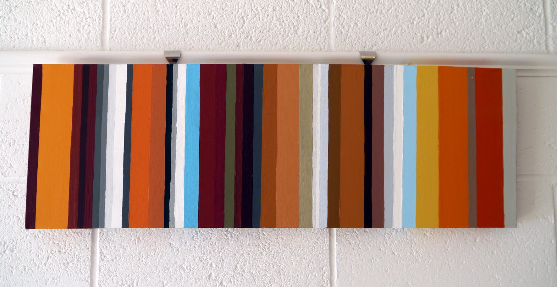
My colour matching to the photographs continues to improve. However, having now mastered teal, I struggle consistently with burgundy: what looks right on the palette and brush, dries consistently darker than the wet.
I have found consistent lighting is vital – where highlights remain from the same source so it is possible to angle the photograph and paintbrush consistently to aid matching.
My lines are progressing too. I have further developed my technique. The use of the architect’s ruler is vital, as is the use of a flat, square-headed brush. This needs to be held as close to vertical as possible, do not overload the brush and pressure needs to be gentle with gentle underneath support. This means up and down strokes can be made to build up colour without adding blobs. This only improved in the latter stages of the painting, so some lines are neater than others. This canvas is also not totally square, so I had some issues with visually ‘off’ lines, despite them being correct from each edge.
