I wanted to test out painting on some smaller, long, thin, canvases I had found. I also wanted to test out an idea I had after reading about pointillism in Bright Earth: the artists understood that the mixing of the paints then available often lead to a dulling and muddying of the colour – so they created pointillism in an effort to use the pure pigments and allow the eye to do the mixing so to keep the colour as vibrant and luminous as possible without muddying the colour.
My idea was to use dots of all the colours of blue I used in the larger painting to try to make up a composite colour from dots on a test panel. It didn’t work and I hate this. I wouldn’t do it again. I initially tried the dots on the painting too, but early on this was not going to work – neither in the colours or the marrying of the informality of the marks with the crisp lines, so I abandoned this early on and painted a solid colour over it. I also painted a thick varnish over the darkest blue, which I really like. I like the small format, but feel these would work well as a group/series rather than on their own as they seem rather insignificant for what they are.


Where next? Although I still don’t feel much like painting, I am getting more enthusiastic about it I have been preparing some mdf boards for testing – post conversation with Stewart Geddes. He paints on mdf boards that have been shaped and are quite deep. We discussed my floating canvas panels and how those could be created with mdf and a frame on the back – which would make them more standard (and acceptable) for hanging.
My Dad gave me some offcuts of mdf of varying thicknesses – which we cut into test panels (small, large, narrow, square). He has been great at working out a method for me to be able to make the frames for the backs of the panels myself and we are going to have a masterclass next month. In the meantime I am working out how to prepare the flat panels, paint on them and decide which thickness I prefer etc.
I initially sanded all of the panels to ‘break’ the surface to allow the paint to go in. However, on SOME of the panels, this meant it became very fluffy. I painted them all with emulsion anyway and thought I would see how they dried. I left them to dry on my washing airer (!). It is such a useful item for drying art!!!! It allows me to paint the edges and dry them without fluff getting on them.
Stewart suggested I needed to sand them again after painting and do a couple of coats. I wasn’t sure why this was necessary, but did it anyway and BOY! Now I understand why. On sanding the panels, all the marks from the brush strokes were obliterated and the fluffiness went too. This surface looked great. SO, so flat. Something I haven’t been able to achieve with anything on canvas because of the woven texture. Sanding removed some of the paint, so they needed another coat anyway. This time I put on a much thicker coat (rather than the 1st more watery one) and another coat on top of that with brush strokes in the other direction. When these coats have dried, I will lightly sand the surface again – and hopefully this will leave a solid white surface that is very smooth ready for painting. I like the ritual of this preparation. It is painting, but without any expressive qualities and is good for breaking me back in. Stewart said he spends loads of time preparing the panels. I can see why. The surface becomes very important. I am now keen to start experimenting with marks, layers, crisp lines etc. before going on to making complete panels along with back frames.
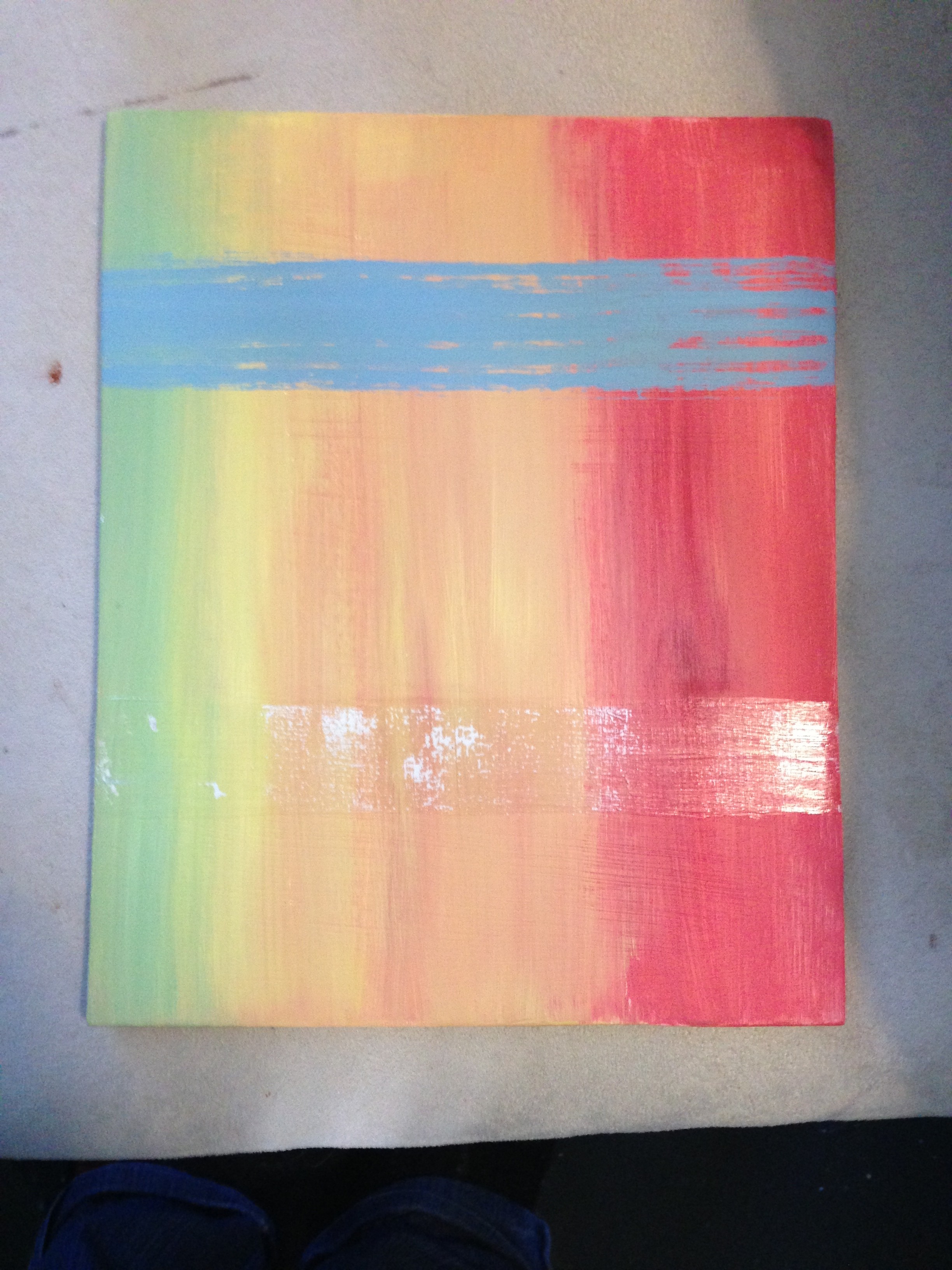
Stewart suggested I get some nylon brushes – which I did – and these were a revelation. They create a fantastically flat surface with solid colour, no ridges or marks. I also bought s brush that had Vs cut into the bristles to experiment with textures – which was also great to play with. I enjoyed painting on the boards. It was easier to paint straight lines than on the texture of canvas. I tried using masking tape on the boards as Stewart suggested. I could get crisp lines with the tape without having to seal the edges BUT, I obviously didn’t let the paint dry enough first as it peeled the first layer of acrylic off the primed board. This was an interesting happy accident. I tried to remove the later layers of paint to reveal previous ones – but still it went down to the primed board. Quite unpredictable and one take I liked and the other I hated. So not sure how I feel about it. But it is something to keep in my arsenal. The first experiment came out a bit ‘vanilla’. I used the colours in order from the diary – starting from the bottom layer. The composition feels rather contrived. But the use of the palette knife and masking tape removal was interesting. It was also easier to create torn edges on the board – so that is something else I can bring from monoprinting into this now I am working on board.
I then tried to see what a ‘lined’ drippy painting would look like on board. Not good I think, in summary!
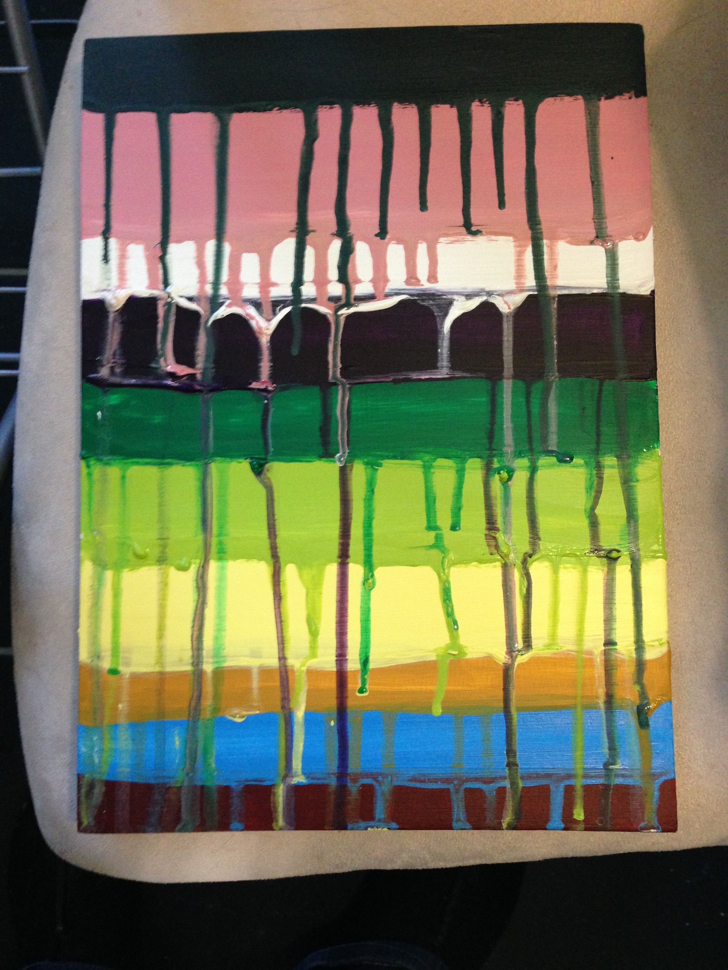
The lines are just too prominent and I think the whole thing looks really amateurish. However, the drippy thing is something I might consider resurrecting. I would be interested in seeing how this would work now with the colours from my diary. I have several of the long format canvases left, so I think it is worth trying. Having spoken to Stewart about scale and size I think there is something quite intimate about these despite them being quite large in size. I enjoy doing these and the happy accident aspect of these works is always interesting. The use of the diary for colour and ordering gives these more of a ‘reason’ than just picking colours I like and allowing the colours to mix as an accident is far preferable to blending the colours myself.
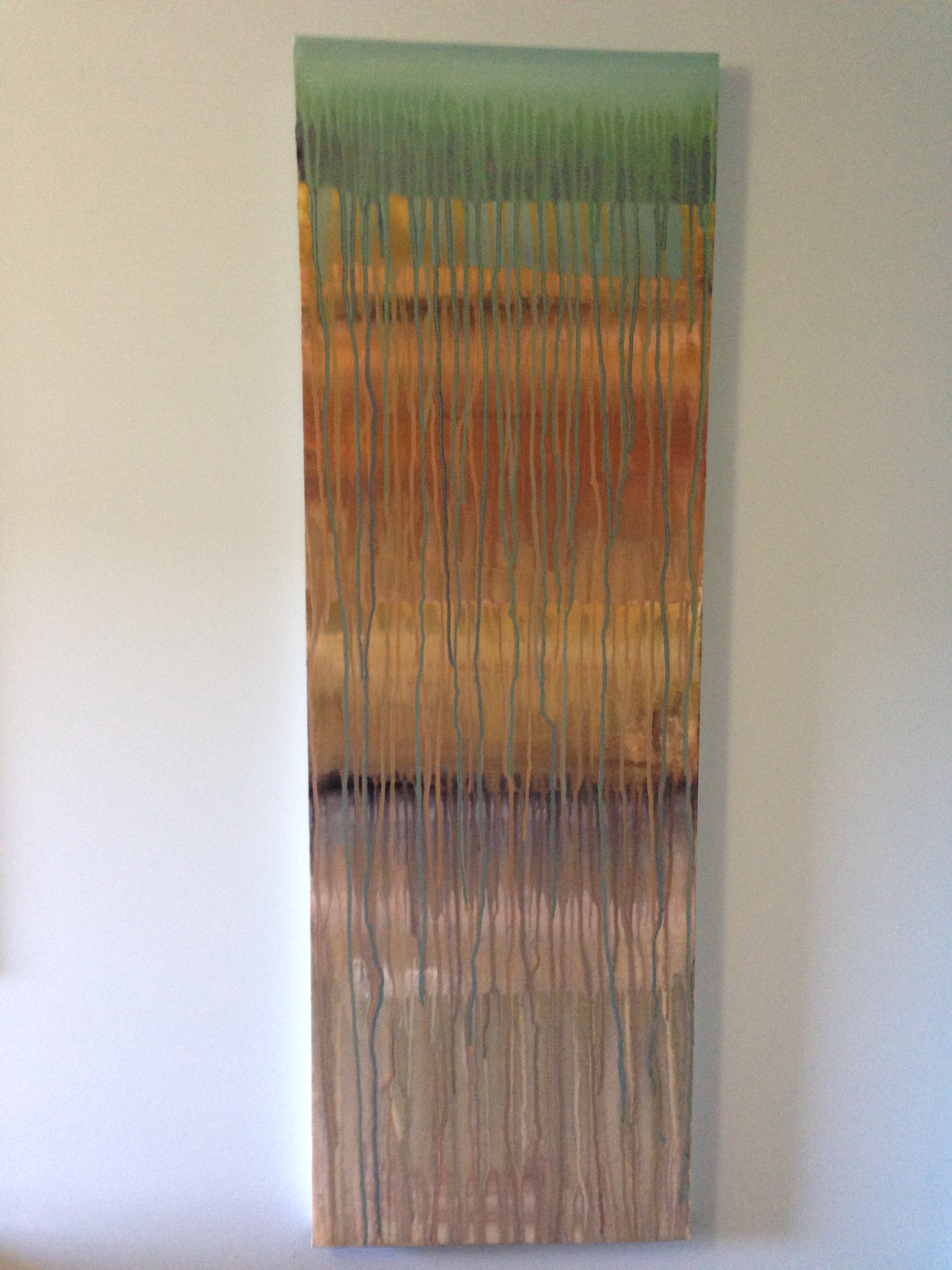
I then did one final test piece. I put an ochre base on this board – but mixed a metallic gold into it to create an interesting shimmer. This did give another element to the colour. I then decided to experiment with the Vs brush again and create texture with the paint. This worked well and I really like the effect. I tried Stewart’s suggestion of thin paint scuffled on top of the base colour. Again I used masking tape to keep the edges sharp – and again it pulled off the paint to the base board (I’m too impatient and obviously the faithful hairdryer can only dry a colour so far where time completes it). Consequently I had to patch up the ochre colour and in the middle I added some extra texture.
I pulled some blue across with the palette knife which gives texture and interest. I like this. I like where it has picked up the underlying texture colour too.


I then scuffled some green over the top without constraining the colour and allowing it to run over the previous colours. Interestingly, the angle of the marks is opposing to the colour previously laid down – I don’t remember consciously making a decision to do this. I then added a sharp-edged solid green over the top which I added varnish to when dried – picking up on a quote I had just read – about using varnish to enhance, or equalize colours/tones/textures. I pulled some varnish down over the red with the V brush, which (it turns out) had some of the cream colour still in the bristles. Another happy accident which I rather like the effect of. Obviously I could make opaque pulls within the varnish (as here) and also thin coloured varnishes that could affect the colours underneath too.
if you’re moving from one flat colour to another flat colour, if there’s a difference of texture – if one is matt and the other is shiny – that contrast of tactility can keep them visually in the same dimension. It keeps them adjacent – side by side. Another reason is that a matt colour and a shiny transparent colour are emotionally different. If something is warm and fuzzy and dense we have a kind of emotional response to that. If something is clear and you can see through it, like yellow or green or red can be, we have a different emotional sensation from that.
Kenneth Noland, Colour, Format and Abstract Art: Interview with Diane Waldman, 1977. Colour – Documents of Contemporary Art, Ed. David Batchelor, P167-171
Whilst the final board (shown previously) doesn’t work, photographing crops of this has revealed some great compositions that I would happily recreate as individual paintings. What is interesting about these is that they could be scaled to be monumental or intimate – it all depends on the size of the brushes used to make the marks. However, it is impossible to recreate on a monumental scale (which I would want to do with these – give the impression of something very intimate at a distance) because brushes don’t scale up in the same way as a canvas does – a brush hair is only so thick – so unless I want to find new materials to use to create this effect, I may need to park this idea for a while. But it is worth remembering these crops to see how simple composition works much better. It brings them back in line with Barnett Newman and Rothko for simplicity with intricacy in the marks.
Next steps: to make further stripe paintings on board (as Ian Davenport and previously). The use of the ruler on the board was far more successful than on canvas or canvas board – and certainly more than the masking tape. I need to keep a momentum in my work and waiting for layers and layers to dry (when I can’t achieve it with a hairdryer) is frustrating and breaks the flow for me. So the ruler is probably the way to proceed for me to make sharp lines. I will dig out my frog tape and give that a go with the board.I also need to investigate deliberate bleed of colour as per Stewart’s suggestion. One interesting format is to create a long, thin board for stripes (that could be vertical or horizontal) – rather like the photographs I tried to run around the studio.
