I’ve been on the look out for stripes everywhere. After my chat with Les, I have started to see stripes in the landscape and in unexpected places as well as those you would expect.
What is interesting is that we are naturally surrounded by stripes, but rarely notice them. So, again, I have been recording them to create a journey. In this instance I could see a shelf of books through a window in a book shop in St Ives (at least I think it is a bookshop – the entrance is not facing the street…). I read the books on one shelf from left to right picking the most predominant colour (unless it was a solid white background) on the spine.
These are the results


Another idea I had was of presenting colour via pieces of music, I decided to test this out with one of my favourite pieces of music: Fur Elise.
I assigned each note a colour from the spectrum (12 notes = 12 colours on the colour wheel) and each octave became lighter if it was higher or darker if it was lower. I then mapped each of these colours to the notes.
This is the result.
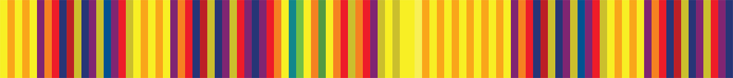
I have to say, I am rather disappointed by the result. Something I had failed to appreciate, and indeed anticipate, was the repetitive nature of melody. What makes something memorable is the repetitive nature of parts of the melody – a hook if you like. And this melody rarely moves out of 3 octaves – so the colour range is also limited to a quite vibrant palette. I wanted to use the spectrum to take away my own ability to ‘affect’ the outcome by assigning specific colours to the notes. But, actually, by assigning ANY colours to the notes would make the outcome repetitive because of the very nature of music and the mapping method used.
I think if I were to continue with this area of investigation I would need to reconsider the assignation of colours – perhaps I would need to restrict the palette to make it more interesting – but I am not sure how. At present I will continue with my journeys and remembered colours.
I have noticed – while looking at my finished panels – that the colours mapped from my memory are far more vibrant and interesting than those taken from photographs. The photographs are much more muted – there are far more neutrals (even in the ‘highlight/interest’ colours) than there are in memory – where the colours are very vibrant and far less ‘natural’. It is interesting how remembered colours really are ‘removed’ from an object and are almost a ‘created’ colour such as one would see in plastic or in print – rather than the colours one sees in nature from the photographs. Interesting to ponder.
Whilst on holiday I took the opportunity to capture images that seemed to have natural stripes in them. These may have occurred naturally – such as in rocks – or transiently as in clouds.
I then created a striped version from these photos. I used the same technique as Richter did when he reappropriated some of his own images. He used a one-pixel strip from one of his paintings and extended this strip to make a series of stripes. Source http://www.fastcodesign.com/1670817/gerhard-richter-goes-digital-reducing-his-old-paintings-into-patterns. I did just the same – picking a one-pixel strip and extending it across to cover the whole image. Below are some selected original images and the stripes that resulted.
These still, very clearly, read as landscapes. There are very few that you can’t see as a landscape. But it is interesting how much more detail there is in a one-pixel strip than appears in the image. Areas of apparently flat colour are made of a huge number of hues and tones which become far more visible as the pixels extend. I rather like them, but they are almost too intricate and detailed for me. I think I want them to be simpler.


The images that are most interesting here are the ones from the rocks. The landscape ones read as landscape only from 1 pixel – although I know I was looking for stripes in the landscape anyway. Those which have vertical lines are also more interesting as the change in orientation of the stripes instantly breaks the landscape reference. I still feel that the stripes are too intricate and need to be simplified, but it is an interesting development.
Where to next?
I would be interested to see how some of my ‘mundane’ journey pictures respond to the 1 pixel treatment – or indeed any photo I have.
I would also like to see what happens to create 1 pixel strips of a whole photograph to see how that differs – or to take smaller sections so the stripes become bolder and less intricate.
Another area of investigation would be to use different shapes that could be cut in board. The distortion caused by panoramic photos (such as the first image in this post) make an interesting shape for stripes – a bloated panel such as the example below:
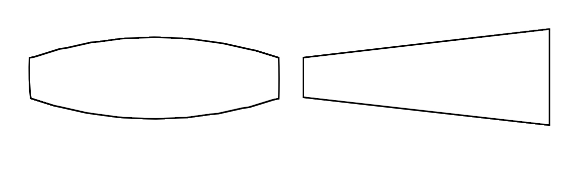
Rhomboids or shapes that suggest false perspective (as above) would also be interesting to try. To create an optical illusion with the floating panels would be most exciting.
