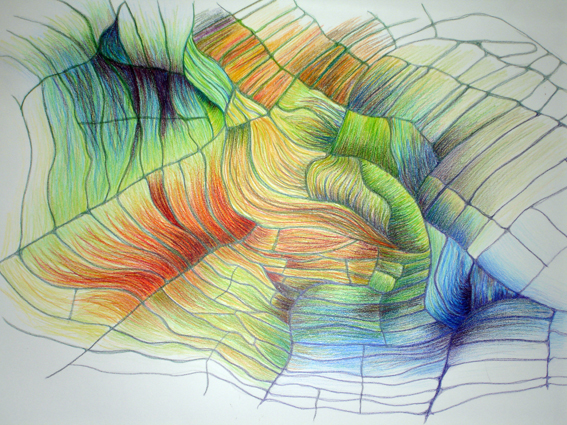
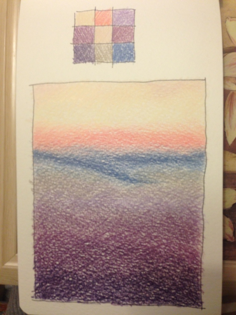
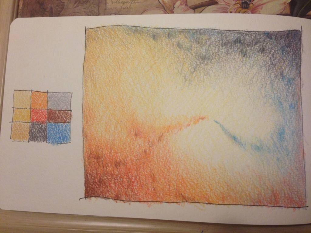
Quite a long time ago (almost a year) I did a colour ‘mindless’ sketch of field shapes playing with colour in the ‘lozenges’ I created. I loved creating this, and playing with
colour so I thought I would do some pencil sketches with my palettes. This allows me to try out shapes and swooshes with colour and some techniques of mixing and mark making. Here are a couple I did tonight. The purple one is far too simple. The colours are flat and uninteresting -despite being well blended. It doesn’t say much, there isn’t any intrigue or real interest. However, I much prefer the second one. With a bolder palette and a much more adventurous approach to mixing colours and adding marks within to spark interest and contrast. The movement also adds intrigue by leading the eye and allowing the viewer to imagine how they arrived there and what happens next. I added the palette on the page too as a reference for mixed colours without it being overpowering in my view.
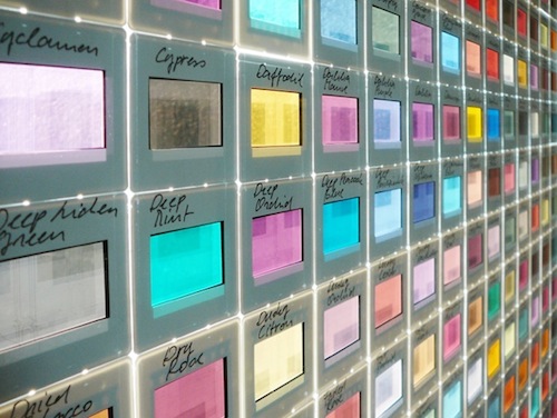
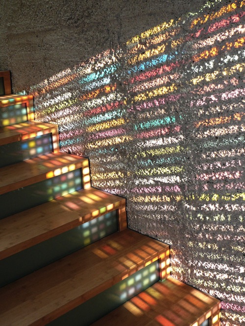
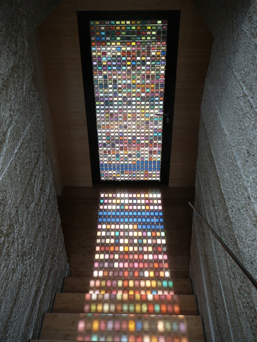
Oooh – and I’ve just spotted this in my media bank when I was searching for an image. It is well worth keeping something like this in mind…