Today I have been mostly making stripes from the first 3 complete months of my colour diary. I have also started adding all the squares into one large square made up of the entire year.
The stripes read in a much more pleasing fashion – the square (while it is interesting for a different reason) is just so confusing for the eye on the small sale I can see it on screen. The stripes read really well and I would love to make each month into a large, gently curved sweeping environment – some areas are calmer and others more invigorating.
In my tutorials we spoke about the colours being a journey – so I wanted to see what happened if I made them into such. So I have also made some simple animations travelling through the colours of each month. The rules have remained the same as the diary (which are placed in the squares, left to right, top to bottom in the order I have noted the colours) – so in the stripes they are placed left to right in the order written in the diary.
I do like them. They are much more pleasing and joyful to me than the square version – perhaps this is because the colours are purer and less influenced by those around them (as there are only 2 surrounding them rather than 8 in a square).
I also created 2 more strips:
- the colours of December but in a pleasing arrangement – this wasn’t overly-considered and was some simple shuffling in some instances, but the outcome is very pleasing.
- selective colours of December. I was starting to arrange them pleasingly on another page and these were the first ones I moved – but in the process I liked this snapshot, so I saved it.
I am in the process of creating a tonal range (palest to darkest) but it is intense on the eyes, so I am only half way through it.
November Sequence 2012 from Amelia Wilson on Vimeo.
December sequence 2012 from Amelia Wilson on Vimeo.
January Sequence 2013 from Amelia Wilson on Vimeo.
Reflection
These works focus on the colours recorded in the first three (whole) months of my colour diary.
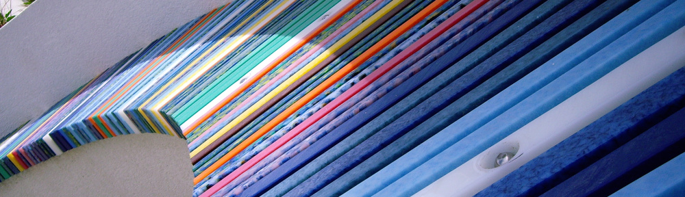
I have tried to move these on from the squares of the original concept as the surrounding colours in the square affect the colours adjacent to them far more than in stripes.
The use of stripes allows the colour to retain as much purity as possible on the journey through the month. I realise this harks back greatly to the work of Stig Evans at Langley Green Hospital but is also influenced by David Batchelor and his work Yuria with Jim Lambie.
Both of these show a progression – a journey – through colour, space and time. Ultimately, this is what my diary has been recording and conveying these to an audience is a challenge.
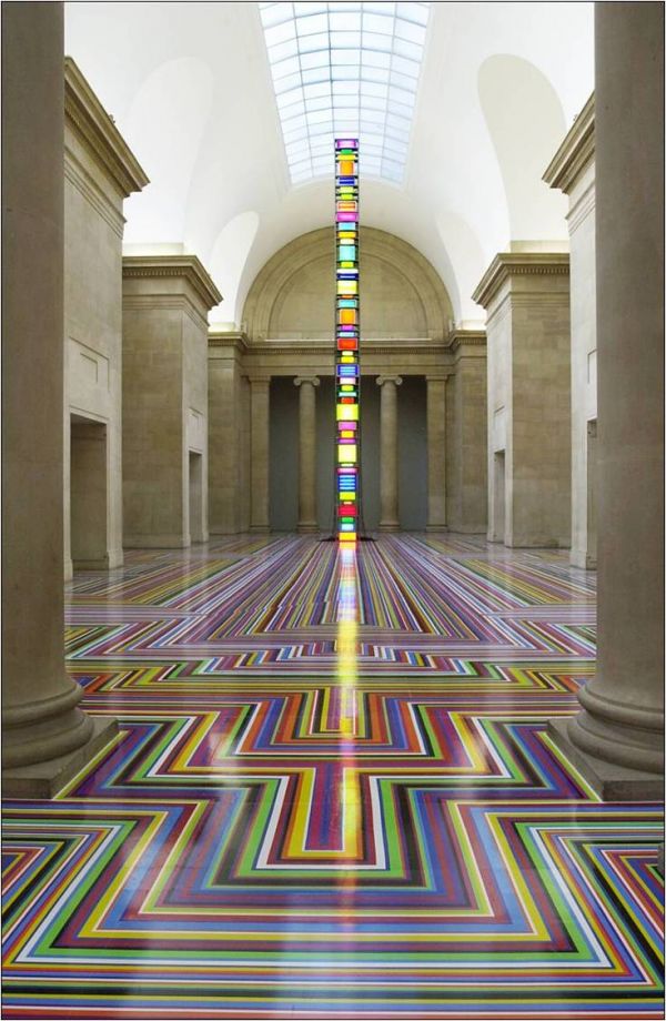
One thing that has struck me from the Light Show exhibition his how work can be physically affected by and throw influence on people with its presence – that is, how light can physically touch you, where a static work cannot. The light pieces create actual environments, where there is no escape from the work, and it envelops and surrounds the audience.
Caroline and I spoke of the diaries being a journey and I wanted to begin to lay out the colours in a way that suggested the time line of a journey.
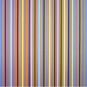
The daily squares work OK on their own, but as a grouping they are very confusing. I am making a large square for the whole year, but it is too busy and overwhelming for me at the moment. There is something Bridget Riley about it too – where she uses the colour to confuse the eye and allows no respite in the space.
However, the resulting stripes are also very reminiscent of the Egypt work that Riley created – the colours being scarily similar at times.
The videos I created from these work well, although I am not sure about the timing just yet. They may be too jerky or move too fast – and certainly the start of them moves off from the first shot too quickly for the start of the month to be seen properly once the video has loaded. This can be remedied by adding a delay to the animation.
What would it be like on a continuous loop? What would it feel like if it whizzed about backwards and forwards and slowed and sped up according to the colours/moods inferred?
It would also be interesting to run out the long strips and display them to see how they view as a whole and if there are chunks or interesting things that can be done with them once printed out – snapshots of time (literally).
I believe the simplicity of these works could be criticised. These are still very ‘pretty’ and the temptation to create ‘pretty’ work with them is still there – but I am trying to restrain myself and think more about keeping the colours in flat planes and shapes. By using them electronically I am avoiding the desire to create an object and muddle the integrity and real purpose of the work by introducing other possible meanings. An object (even a painting with texture) will imply a different meaning to the view that a flat, solid surface of unadulterated colour.
