I restarted my practical work on Saturday. It felt kind of weird to get going again. I have all these things in my head that could be excellent paths for exploration – but (as with everyone – even if they won’t admit it) I was afraid to start in case the evolving reality didn’t live up to my expectations.
I wanted to look further at where colour meets. Taking inspiration from where I left off at the end of the last module and with Rothko and Patrick Heron prominent in my mind. I also wanted to investigate using other sharp edged shapes made from filler. In this instance I wanted to investigate using circles. I sourced some ‘punchinella’ (the remnant sheets that sequins are cut from) and some macaroon templates.

I wasn’t particularly careful with the smoothness of the filler as I really didn’t expect this to work. As I was pushing the filler in I could not envisage how I could remove the punchinella without ruining the circles, so I had resigned myself to this being a failure. The macaroon template was much easier to fill an I assumed the filler would easily stick to the canvas or dry in the mould and be easy to pop out. How wrong as I? It was exactly reversed.
The Punchinella worked brilliantly, but I could NOT get the larger circles out of the mould. They would neither adhere to the canvas OR pop out.
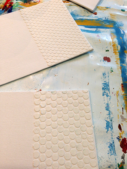
In the end I had to scrap the larger circle idea and revert to the idea of letting them dry within the mould. I turned back to the Great British Bake Off (which is where I had got the macaroon mould idea from) and decided to grease/oil the mould to aid the removal of the filler later. This worked really well (providing I had consistently oiled the mould) and I stuck them onto the canvas with wood glue. This is a good plan for making randomly placed or non-uniformly placed shapes. I somewhat regret not making the punchinella ones neater – but all of the work I did today were tests really for further work.


These are the 2 small canvas boards I used to test out the punchinella. I put 3 colours on these – which may be too few, but may be OK with the visual disturbance of the texture. I tried adding some varnish to the yellow board – which also works reasonably, but oddly seems to create a ‘fill’ within the dots without obliterating the texture. I think these small boards could work really well as punctuating colour on a large white mountboard and framed with a modern white frame. These need a lot of space around them and I feel they need to be framed – whereas my larger work does not.
I also tried straightforward stripes on these small canvas boards (they are approx 5×7″). I’m not convinced by these. What is interesting is that the overlaps for interaction and layering of colour requires space – and lots of it. To get the spread and lines I wanted, I needed a wider coarse brush – but this all takes up space and the most I could really fit onto one of these boards to this effect was 5 colours. I tried to fit on many more, but could not spread out the colour enough to give the ‘dry brush’ overlay. I tried to vary the stripes here and this didn’t work either – for the same reason. This format on this size just left me with the feeling that this piece looks unfinished and lacks finesse. I think this would work on a larger board where the smallest stripe could be much wider and have the quality of line I am after.


What I find most interesting about these is what happens to the works when they are turned through 90 degrees. With the small amount of colours I don’t feel that they give the impression of travelling through time and don’t really have any gravitas to them. However, when they are rotated, I feel much happier about them. They make me feel more comfortable, that they are ‘right’ this way round and have more of a raison d’etre than before. I feel this relates far more to those with less colours than with more.


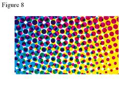
This is a larger, A4 canvas board. On this piece I tried to reflect what I had seen of Patrick Heron’s Horizontal Stripe Painting : November 1957 – January 1958. In this piece I noted that Heron had seemed to knock back the white of the canvas by overpainting it with a neutral colour allowing all the colours he used to show up from the background. I tried this with a wash of gold. Again, all the stripes have come out too uniform. Heron’s don’t extend beyond the edge of the canvas and exist solely within that space. I tried to do this – but couldn’t. I think this would be much easier on a larger scale though. His stripes are also washy at times and can blend to make an overall block of colour visually. I have been reading about the development of pointilism in Bright Earth – at the time Impressionism was developed, paint technology was not particularly stable or refined and often mixing colours resulted in a muddied version of the intended colour. So this technique was developed to retain the intensity, purity and luminosity of the colours by painting in dots/strokes and allowing the eye and brain to create the mixed colour. If my colours are close enough, I could consider doing this.
Looking back on the close up photographs from the previous module, I think these hold up reasonably well and certainly warrant further exploration. These experiments on a small scale allow me to experiment with proportions before embarking on larger works. Nothing about them is precise, the colours are not accurate, but as proof of concept, they have allowed me to see what does and doesn’t work.
It might be interesting to create a ‘journey’ through the overlaying of stripes with the overlap on one side only (i.e. all stripes overlap on the left or right only) giving the impression of a front and back to the piece; equally, some could come to the front or back and I could play with receding colours by pushing them to the front and vice versa.
It might also be interesting to play with the dots (punchinella) and pure colours and allowing the eye to mix the colour at a distance – this is also how the printing press works. I would be interested to see what/how this could be replicated in paint. Each ‘dot’ area is filled with more or less of the ink and relies on the eye to make up the colours for you. This could be an interesting concept.
PS: one of the interesting things was the wiping back of where the colours overlap if the marks do not reveal enough underneath. This may be a interesting concept full stop for the overlaying of colours.
