Whilst in Wales I took the opportunity to start collating my ‘source’ material from my colour journeys. This is a fairly long process and involves me taking the journey images, picking the 9 colours and having photographs of these printed so I can paste them into my journals to use as a library of source material for physical work at a later date. They also work well as a visual record that can be compared and contemplated in a relaxed fashion which I don’t find possible when viewing electronically. Photographs are also relatively stable – particularly in closed books – and are easy to use for comparison charts to other materials such as paint and fabric for physical work.
For these journals (which were – I’m sorry to say – whatever was cheapest and fitted the format in the Paperchase sale) I wanted to title them. I can live with the covers being ‘not to my taste’ if I can decorate the inside how I wanted. So I consoled myself with creating a frontispiece and titles for the start of each journey.
I am not a typographical sort of graphic designer. Ask anyone… I’m an image kinda girl. I like big, punchy, colour saturated images – I find type difficult, but I loved hand drawing the letters for these. Doing as I pleased, no set font or part of the alphabet being right and some not etc. They were great fun to do (if a little difficult in the windy conditions by the sea!)


I also (finally) put together my ‘test’ colour journey book. It was hard to get the paper drill to work through the sheets of paper – nothing was terribly accurate and the paper dirties up quickly if you are manhandling it lots to get the hole through. (Lesson learned!) So I have decided to abandon the paper drill and have gone for a leather punch, where it might be a little less precise, but will take less than the 2 hours this took!
However, I am pleased with the results – and would make the book titles more ambiguous for future ones as discussed with Stewart.


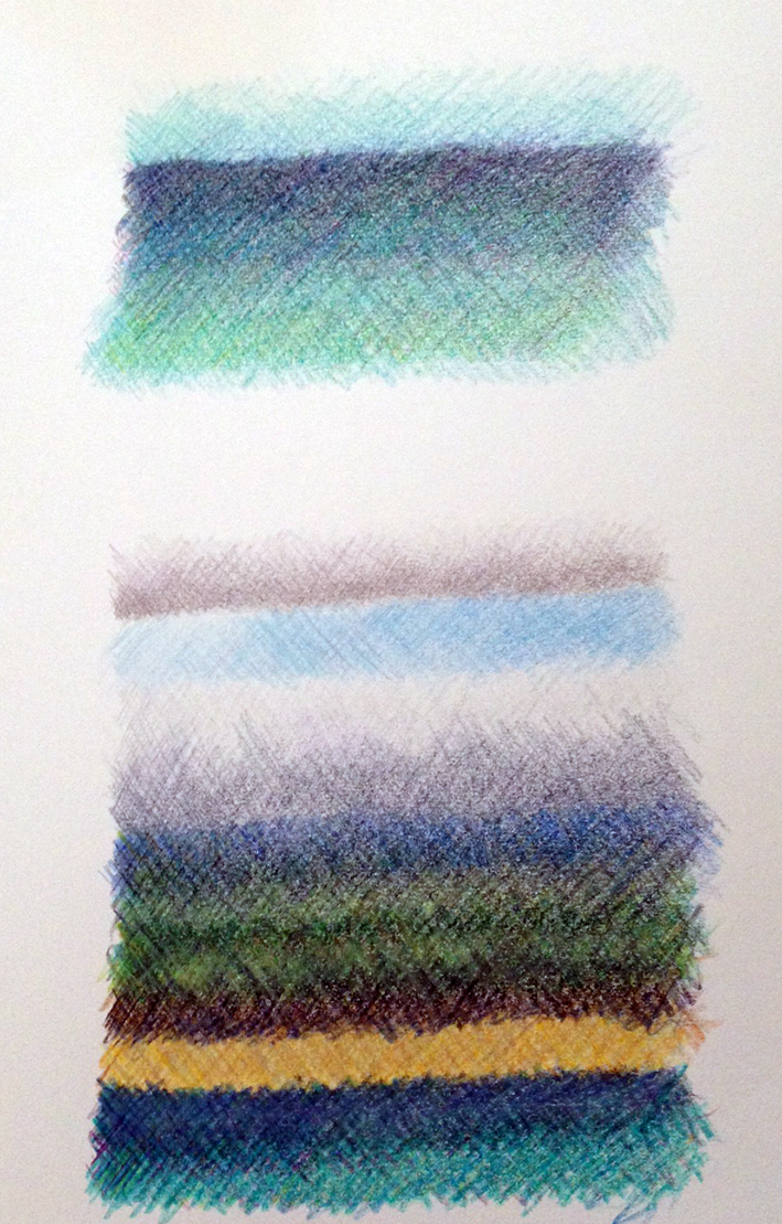
I also made an ‘in the moment’ colour stripe sketch. I don’t usually do this sort of thing – but the colours in the landscape were so brilliant and ‘buzzing’ that I had to! See this post for more information on the stripes I could see in the landscape.